OKSolar
Improving on Solarized using the OKLab perceptual colorspace
tl;dr: This is a long post about what is basically a tweak to an already great color scheme. I went down the rabbithole of color theory because I was bored, and this is what I produced. If you just want the final result…you’re looking at it (this site uses the OKSolar color scheme). You can also skip to the end, or get a JSON file with the hex and OKLCh values for it here.
I was a long-time user of Ethan Schoonover’s Solarized, an aesthetically-pleasing and very usable color scheme for the terminal and code editors. However, I found the contrast lacking, and I usually ended up tweaking the background and foreground colors to stand out a bit more.
Solarized was developed using “precise CIELAB lightness relationships”, which I thought would have prevented this issue. The problem is that CIELAB isn’t perceptually uniform. Practically speaking, this means different colors appear to have uneven lightness differences to a human observer, even though their L* values (the shorthand for CIELAB’s lightness component) are the same. CIELAB was developed in 1976, and the color difference metric it was based on has long since been obsoleted.
To demonstrate, here’s some Solarized-highlighted code in both light and dark modes, and how it appears under a monochrome filter (simulating monochromacy):
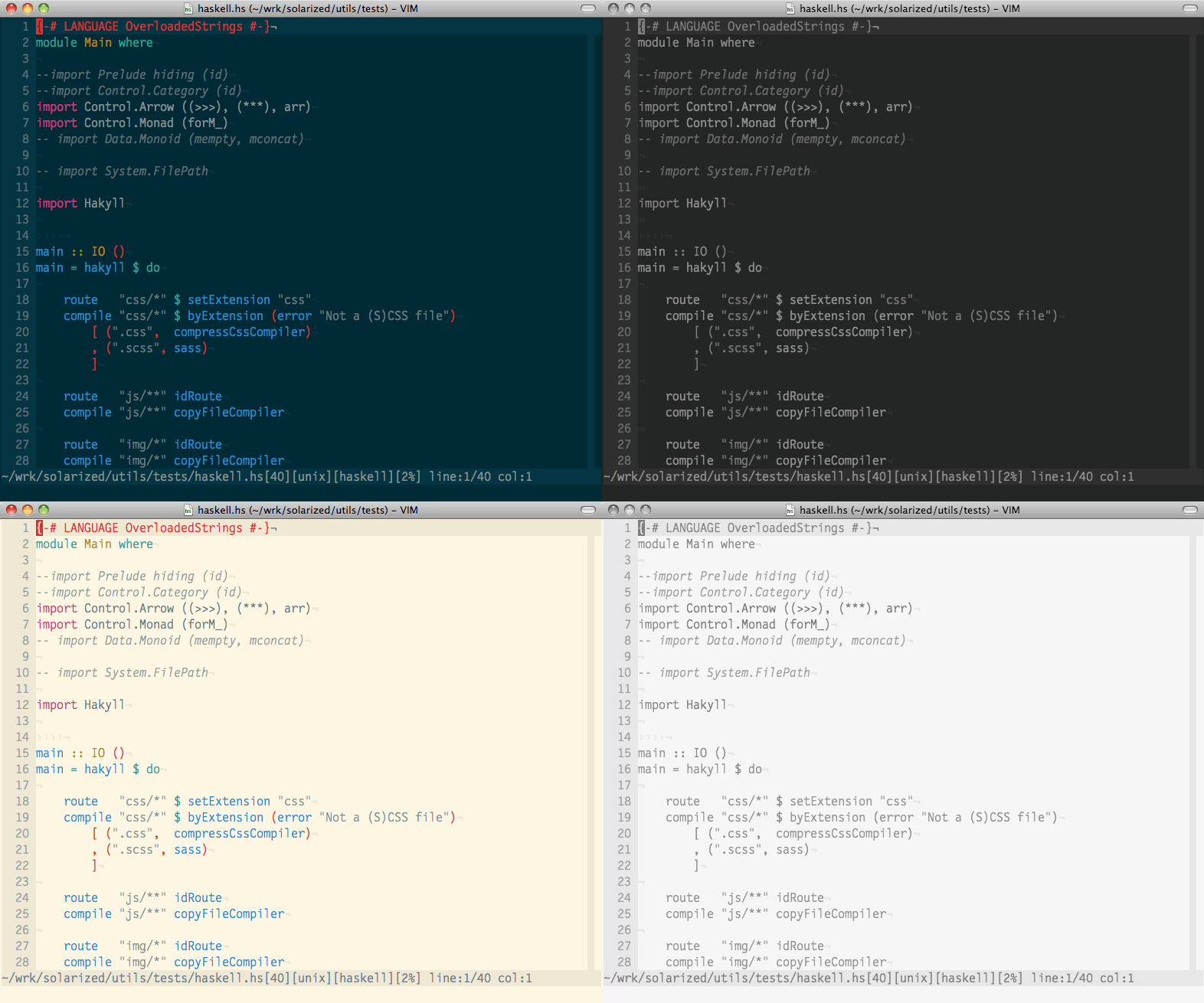
For me, the contrast between text and the background is just a little too low (especially if I’m working in a bright space), and you can see that it also varies between different token types. I know that the goal of syntax highlighting is to add visual structure to code, but I’d prefer that were done through color than through brightness.
OKLab
OKLab is a relatively new colorspace (that is, a way of describing colors) defined by Björn Ottosson in December 2020. It was derived numerically using the state-of-the-art color difference metric, and achieves a much stronger guarantee of perceptual uniformity than CIELAB. That means that two colors with equal OKLab lightness values will appear equally bright to a human observer. Despite its newness, it’s caught on enough to be part of the CSS Color Module Level 4 Draft, and Safari already supports specifying colors in it natively.
Here’s a constant-lightness rainbow in OKLab, with lightness of 74.6% and chroma (a measure similar to ‘saturation’) of 0.124:

Armed with OKLab, I reapproached Solarized from first principles, using the same style of composing base and accent colors, but fixing the lightness values in OKLab and then tweaking the other components.
Examining Solarized
First of all, here’s what the Solarized palette looks like, in light and dark modes:
foreground emphasis secondary highlight
yellow orange red magenta violet blue cyan green
foreground emphasis secondary highlight
yellow orange red magenta violet blue cyan green
Subjectively, the light background seems to have a lower contrast with the yellow, green and cyan text, while the dark background has lower contrast with orange, red, magenta and violet. I also find regular foreground text to be a little low contrast for my taste.
OKLCh Values for Solarized
For the rest of this article, I’ll be specifying colors in LCh format, which is the cylindrical form of Lab. The conversion between the two is pretty trivial, and most systems that accept Lab co-ordinates also accept LCh co-ordinates.
To evaluate Solarized in objective terms, I mapped the colors to their OKLCh representations:
Yellow, cyan, and green all have higher lightnesses, and orange, red, magenta and violet skew lower (hence why there were discrepancies in contrast between light and dark backgrounds).
For both light and dark modes, I looked at the base colors (foreground, emphasis, secondary and highlight background) and calculated the contrast in lightness with that mode’s background:
The light mode has higher contrast overall, both color schemes have a pretty even highlight contrast, and the dark secondary is a fair bit lower contrast than the light one (so, for example, code comments would be less legible in the dark mode, which I subjectively agree with).
Building OKSolar
Sticking to the original vision of Solarized, I manually iterated on colors in OKLCh space to find an analogous scheme such that:
diff(background, accentColor)was equal for all accent colors against a given background;diff(background, accentColor)was consistent between light and dark mode;diff(background, baseColor)were each consistent between light and dark mode;- Every color was representable in sRGB (it’s possible to specify colors in OKLab/OKLCh that are not describable in web-compatible RGB, and not displayable on all monitors);
- Hues and chromas deviated as little as possible from the original color scheme.
I call the result of this effort OKSolar. You can get the raw values in a JSON file here, and here’s a small demo:
foreground emphasis secondary highlight
yellow orange red magenta violet blue cyan green
foreground emphasis secondary highlight
yellow orange red magenta violet blue cyan green
I think the accent colors look a lot more even, and that regular text stands out more without clashing too much with the background. One notable change I made is that ‘emphasis’ is now expressed through chroma rather than lightness, with emphasized text having a more saturated color than regular foreground text. This because a lot of the highlighting schemes and CLI tools I use also make emphasized text bold, and the combination of bolder and brighter was just a bit too much.
Here are the OKLCh and hex values for the color scheme:
And the table of lightness differences, similar to the one I calculated above for Solarized:
Things are much more consistent between light and dark mode now. The small discrepancies arose where I manually adjusted things to keep a color in sRGB, keep a color saturated, or maintain distinguishability between accent colors. Text rendered on a backlit display also significantly affects its appearance, no matter how closely the colorspace models human perception, so I also exercized personal judgment when making adjustments.
Base Hue Customization
One thing you might notice from the OKLCh values for OKSolar is that the base colors draw from a set of only 3 hues. By fixing the lightness and just modifying hue and chroma, you can easily make variants of the color scheme to suit your taste, while preserving contrast and accessibility:
foreground emphasis secondary highlight
yellow orange red magenta violet blue cyan green
foreground emphasis secondary highlight
yellow orange red magenta violet blue cyan green
foreground emphasis secondary highlight
yellow orange red magenta violet blue cyan green
Note that you’ll need to tweak chroma values, because OKLCh’s chroma is not orthogonal: that is, the perceived saturation of an OKLCh color can change as you vary the hue, even if you keep the chroma fixed. Check out Björn Ottosson’s great post on OKHSL and OKHSV to learn more about this.
More Resources
I made heavy use of the Evil Martians OKLCh Color Picker in writing this post and experimenting with OKLCh itself. I also recommend reading both the original OKLab and the OKHSL and OKHSV blog posts; they’re good primers on the colorspace and provide background on modern color theory in general.